Branding thoughts
What does your brand say to the world?
What colors do you use in your branding and what are they saying to the world?
Are you effectively communicating your intention of the company to the world?
Lots of questions, and lots of thought needs to be put into the “brand” you develop as a small business. In past posts we looked at color theory, and the use of color to reflect certain thoughts. When Steve and I began wrapping our soap we wanted it to be clean, simple and reflect the simplicity of the product. Classic black print on white conveys our commitment to tradition, to purity (white), yet inexpensive luxury. As we moved to developing our company image/logo we chose a sunflower. Large, soft yet sunflowers grow strong, produce large heady flowers that offer more than just beauty – providing food for birds and man. We liked the imagery of strong stalks, magnificent heads of golden yellow/orange petals, and black/white striped seeds. And sunflowers evoke that late summer harvest. The bumper crops are in, the fields are ripe with harvest. We want our brand to evoke that bounty, that rich variety, and natural choices. Colors are powerful. Images can transport our thoughts to places that are exciting.
Every time a consumer interacts with a brand, an opportunity exists for the company to influence their audiences’ perceptions. It is up to the marketer to decipher which design and colors will influence the consumer to purchase. By educating oneself on the psychology behind color theory, marketers can further tap into branding techniques and better connect with their market, leading to a stronger brand-consumer relationship and increased profit.
Up to 90% of people’s assessment on products or services is based on colors alone. Provided we perceive the brand color as one that fits the brand personality, our likeness of the brand can be greatly persuaded. However, the study The Interactive Effects of Colors show that the function of the product must be congruent to the color through which it is displayed. In other words, a product’s personality must be reflected in the brand’s colors.
So what about color? I found this chart that captures the essence of color theory:
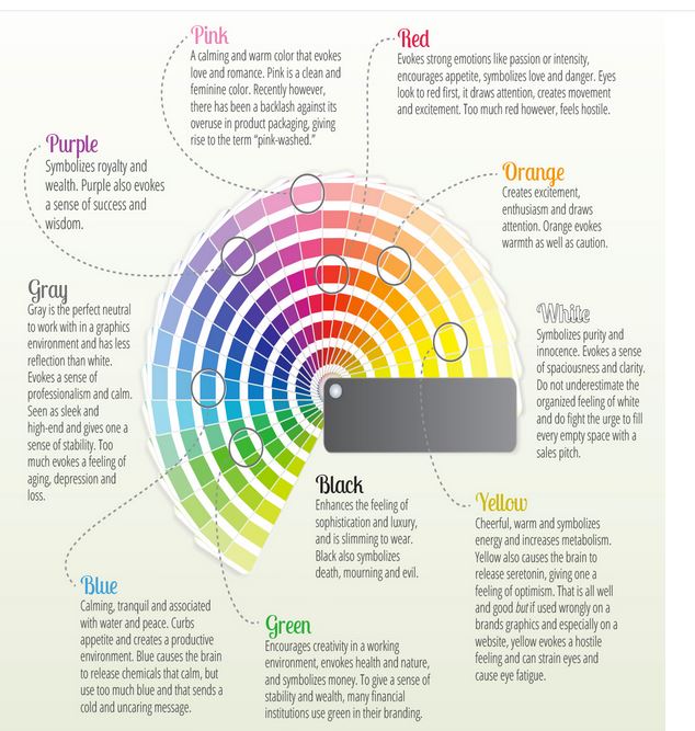
If you are just starting out and thinking about what colors to choose, or what you want your brand to express this chart might help. Branding is an interesting aspect of creative businesses. Here are a few questions to ask yourself:
- What is the goal of my business?
- What is my personality like? energetic? calming? cheerful? innocent? aggressive?
- How can i present my company / product to the world with a story told in color?
- What color or colors do i naturally gravitate to?
- How do others react to my color choices?
Take time to think through color, remembering that it does have an impact on your business.
When choosing brand colors, it is arguably most important to consider brand personality. Consider what color suits the characteristics of your product, and colors your competitors use. It is crucial that the brand color is appropriate, yet differentiated from competitors. Clearly, a camping brand who markets itself as outdoorsy and rugged wouldn’t want to use pink sparkles.
To better decipher brand personality, consider these five dimensions, or the five ways people consistently react to brand identities. Most brands fall into one trait, but some have crossover.

As i read this chart there are brands that jump to mind…. for example “Ruggedness” brings to mind brands like Lands End… a company that focuses on outfitting for the great outdoors. Honestly if we take time to look around us we can see these 5 dimensions visible in every brand on the market.
You must be logged in to post a comment.