Thoughts on color
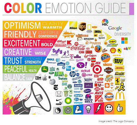
Color theory is a broad topic. Recently Enterpreneur.com ran an article on the impact of color on brand. Fascinating is the idea that we attach meaning to colors. But its true. And the choice of color for your business brand might indicate or infer these qualities. I borrowed the image from the article which illustrates the inferred quality of the color, and who is using this in their branding. Interestingly we use a lot of yellow in our branding, and i had no idea it stood for Optimism, clarity and warmth which defines us well.
Color has purpose. It sets the mood, and sends messages. But before using color its really important to understand what colors are preferred, and which colors are not. Color studies are common when developing marketing plans. Is there a difference in color preference by gender?
Yes, Studies are replete with explanations of differences.
Perceived appropriateness may explain why the most popular car colors are white, black, silver and gray … but is there something else at work that explains why there aren’t very many purple power tools?
One of the better studies on this topic is Joe Hallock’s Colour Assignments. Hallock’s data showcases some clear preferences in certain colors across gender.
It’s important to note that one’s environment–and especially cultural perceptions–plays a strong role in dictating color appropriateness for gender, which in turn can influence individual choices. Consider, for instance, this coverage by Smithsonian magazine detailing how blue became the color for boys and pink was eventually deemed the color for girls (and how it used to be the reverse!).
Here were Hallock’s findings for the most and least favorite colors of men and women:
Blue is the prevailing most favorite color of both men , while orange and brown are least favorite of both genders.
Another interesting thought about color studies is the name of the color makes the difference on whether it is liked or not. Multiple groups were shown the same brown, but some were told it is mocha, others were told it is brown. Unanimously the brown was disliked more often, but the mocha was favored. There appears to be something more with specific names of color.
I experimented with names of color last spring when i chose a palate that was very food oriented. Sweet Potato instead of a soft orange, Wasabi instead of a light chartreause, Mocha instead of medium brown, and so forth.
On a personal note i have realized how sensitive i am to the names of color, and more often than not it is the perception based on color name that draws me in.


You must be logged in to post a comment.