Packaging update
 Upcycling is in my blood… omg, i have turned into my mom, making use of what i have, and taking advantage of free things… but with a cavaete – they have to add value, improve brand, and be readily available.
All of this happened recently when I was made aware of a company tossing out reams of thick gray dividers…. previously used as dividers for proposals, and reports. Thick 80 lb card stock that was 9 inches by 11 inches.. with tabs on the right side in one of 5 positions, like file folders have that tab. Tossing out good card stock? OMG – “Can i take some of these reams?” I asked the company – “Sure, they are just headed for the trash, and there is no harm if you have a plan for them.” That said i loaded up my arms with everything i could carry, and made a second trip… I didn;t have a plan then, but it hit me when i got them home.
One of our first packaging challenges was to design a packaging that would protect the shave soap “hockey puck” of soap, and would allow for it to be transported, displayed, and stable on the shelf. We investigated purchasing boxes, only to discover that pre-made boxes were either the wrong size or far too costly.
A quick search of the internet and we discovered hundreds of free patterns for boxes. The first one i printed, and cut out fit the soap perfectly, as though it was custom designed for the soap. We knew a year ago when we designed the packaging that we wanted a uniform look, but to distinguish the two flavors of shave soap from each other. We purchased heavyweight scrapbook paper, often waiting for the sales and swooping in for the savings. But that was beginning to add up.
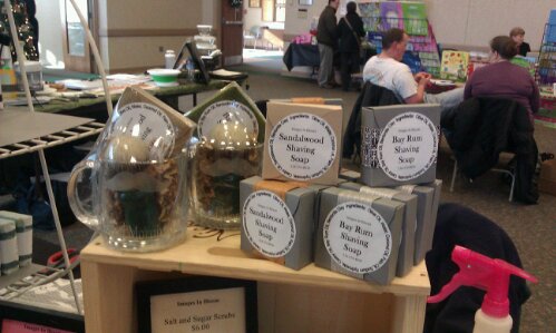
AHA! The AHA moment came about how to use those gray cardstock indexes…. boxes. I made the first prototype and we liked it. Masculine gray… has a manly feel. The next thought was distinguishing the fragrances…. that is where we decided to use scrapbook paper cut in 1.5″ strips as a band around the box to identify visually the difference. (Yes, the label says it clearly, but not always do people read the labels!!!) We have tried to keep our bar soap and shave soap labeling clean… plain white paper with black print… nothing elaborate. The distinction being a band placed under the white label. So in the photo above is our first roll out of the new boxes/packaging for the shave soap. If you look carefully you will see the shave kits and one sandalwood shave soap still have the old packaging.
What do you think? Is gray more “masculine”? Does our new packaging appeal more? Drop us a comment.