New ideas in display
I am always trying to pull my display into something that looks attractive, and something that people can easily see what is being offered. Several years ago i invested in several wrought iron towel racks that have two arms and two large hoops… it works well to display 5-7 pieces of silk on each rack. But i realized that sometimes I need to showcase a special piece.

As i may have mentioned, i have been following the design colors of the season as set by New York Fashion Week, and Panatone. For this fall the colors are rich and vibrant, with colors like celery and samba.
I could not resist trying to dye several pieces to the palate. The handbook for Fall 2013 offered various designer concepts using two or three of these colors. I printed the handbook, chose patterns and matched my dye to their colors. Here are the inspirations:

 And to showcase them at TAA, I bought 8×10 frames, and framed each of the designer concepts, then gently draped my scarf over a corner of the frame. This created some buzz… however i can;t tell you how many people wanted to know if I have the skirt at the left drawing for sale. (Me, sewing designer clothing, i highly doubt it!!!) After I explained the concept they often were more fascinated. At the left is the Samba and blue (turbulence) scarf with silver metallic resist to accent the pattern. This was tried on by so many people, and finally one woman stopped right in front of it and just stared. I asked her if i could help…. she said “Oh My, this is my sister’s style… i can see her carrying these bold colors with her lovely brunette hair and soft complexion… i will take it.” She never looked at the price tag… said she was surprised it was not as expensive as she expected. wow. blown away that this work connected with someone… this is my hope, to appeal to people who can see themselves or someone else wear my creations in their style.
My most favorite color palate was the center image above with Acai  (shades of a deep violet purple), Samba, and Linden Green (a celery colored green). I would have never thought to put these three together, but challenged myself to create a scarf based on this palate. I returned to my large flower motif created by Kumo Shibori technique, or gathering cones of fabric, binding then dying. While I realize that the designer’s concept was very linear, very geometrically square, mine was not. the purple violet dye lightened in the steaming process, so the colors were not quite spot on. Copper accents play off the strong colors to create shimmer. My scarf is a vibrant mix of colors that may frighten away some people, but against a dark suite, or a black dress it adds electricity, spark, snap to the outfit.
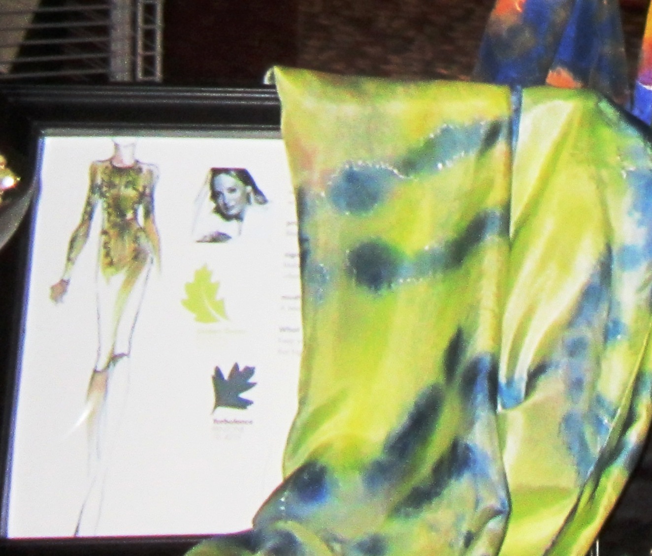 Finally I displayed a scarf that is in Linden Green (celery) and Turbulence (a smokey blue). For me this was an unusual combination. I have dyed using greens and blues, but never such a light hue of green against a dark hue of blue. The pattern formed from folding and dying was an intricate design that interlocked and repeated, but it was softened by the dying process, so it had wispy feminine qualities. Small amounts of silver metallic resist accent the piece, giving it shimmer. A distinguished woman stepped up to that scarf, put it on, looked in the mirror and the other women at the table said – oh if you don;t get that you will be kicking yourself… it makes your eyes pop. She has such vibrant blue eyes. She also did not look at the price, but simply bought the scarf.
So this is my question to myself – was i shameless in using someone else’s design concept to design the dye plan for my scarves? or was that creative marketing to concepts the fashion world lives and dies by? Most fiber artists resort to grid walls, and place their work on hangers, on angled racks called waterfalls… I just don;t want to do. I think that my work is displayed in a way that still reminds you it is one of a kind and hand dyed.
You must be logged in to post a comment.