The joy of Shibori
Last night i spent the evening with a pile of silk, my dye, dental floss and metallic resist. I was in heaven.
Silk is an amazing fiber for dying and painting on. It is a very viscous fiber, thirst for anything that comes in contact with it. If silk is not restrained in any way dye will run and spread out on the surface until it has reached as far as it can spread. So the trick of dying silk is manipulating the way the silk absorbs the dye.
There are several ways of doing this.
1. Traditional Serti Method – this involves stretching the silk on a frame, and with a substance called gutta carefully drawing an outline, much like a coloring book picture or a chart/plan for stained glass. Each section must be carefully drawn to allow no gaps in the gutta drawing on the silk. After it has dried gutta acts like a resist, prevents the silk from being able to absorb dye or paint where it is drawn. I pulled a graphic off the web from dharma trading company that shows the process well.
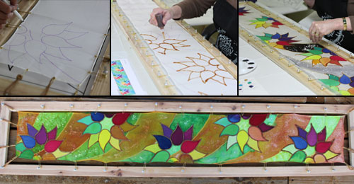
I must tell you that I have amazing design ideas, but there are those occassional gaps in the drawing. Gaps allow the dye to run through to places they should not go, marring the design. And that makes me totally stir crazy. While i have practices this method, it is not my favorite.
2. Shibori Method – No stretching, no applying gutta… but instead it involves folding the silk, binding, stitching, clamping… each type of shibori uses other methods for setting up the resist. I prefer Kumo Shibori, which is a process of gathering tufts of the silk, and binding it at varying lengths. Where the binding is tight the dye stops, or softly blends to the binding. The art of Kumo Shibori is to think through how the fabric is folded, and where the pattern is to be placed. It is a controlling of the dye on the fabric through the folding, and application of dye.
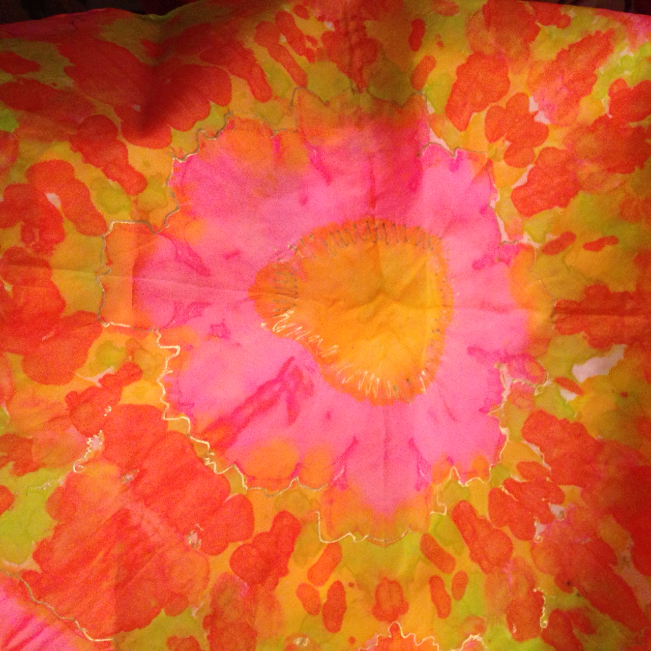
And the dye can also be manipulated by application of more water to thin it, or alcohol to cause the dye to react in organic ways. Dye can look like solid surfaces, or it can be light like watercolor. And salt can cause the dye to pool, creating granular features in the dye process. Keeping the silk bound will result in creases, and when done well these creases only build on the image you are striving for. Here is one example from the past – the silk was gathered into 5 tufts, resulting in 5 flowers.

The first binding was at the center, where the brown/purple fades to chartreause. The next at the blending of the chartreause with the red/pink. (One the other side of the binding i applied a bit more of the purple/brown to act as an accent to make the center stand out more…. unfortunately it crossed the binding and blended a bit with the chartreause, giving an organic orange hue. A final binding at the edge of the fabric divide the red from the shades of green. As the picture shows, the forms are basically the same, but the binding allows for varigation, and thefolds bring out character lines.
So here are a few of the projects i was working on last night. I dyed a total of 14 pieces, of varying sizes, in preparation for the Great Lakes Art Show next week. While I try to stay with the Pantone colors of the season, i did move on to try to create some pieces that are bold and aggressive accents. Others soft accents.

Rather than whole flower forms, I bound this scarf to give half flowers, on the one edge of the silk. Where you see white is where the silk was bound so tightly that the dye did not run into those spaces. I rather like the organic feel of some dye free zones. This scarf is 15″ x 60″ and is habotai 8mm silk. I also love using metallic resist, which is applied after the silk is dry. In this case copper resist was applied to accentuate some of the lines of the graphic pattern. Once the copper resist is dry the piece is wrapped in newspaper, and all of the silk that is ready, and has been wrapped in paper is then bundled in a big old quilt and put into a steamer for 1-2 hours. The heat of steam sets both the color of the dye, and fuses the metallic resist to the silk permanently.
Here is another

Another style of kumo is to gather tufts randomly… so each “flower” is a tuft of fabric gathered, bound and dyed. My palate was a kelly green, chartreause and a bright cyan blue. The tufts created more of a square sense of form… Random, and the colors are a bit softer because i used water to blend them. On its own the scarf was interesting, but the touch of resist adds a level of interest, a sparkle in the light, highlighting some of those higher interest spots.
Hot colors are more popular than ever, especially as we approach the summer. Here is one of my hot colors scarves.
This was bound much like my first example, however dye was applied differently, giving a looser pattern of pinks, yellows, chartreause and oranges. The folds caused dye to pool and give organice character to the scarf. This one has gold metallic resist applied to accent.
And my favorite palate – blue, purple and chartreause.. This was bound like the first example, but what a difference colors make on the pattern:
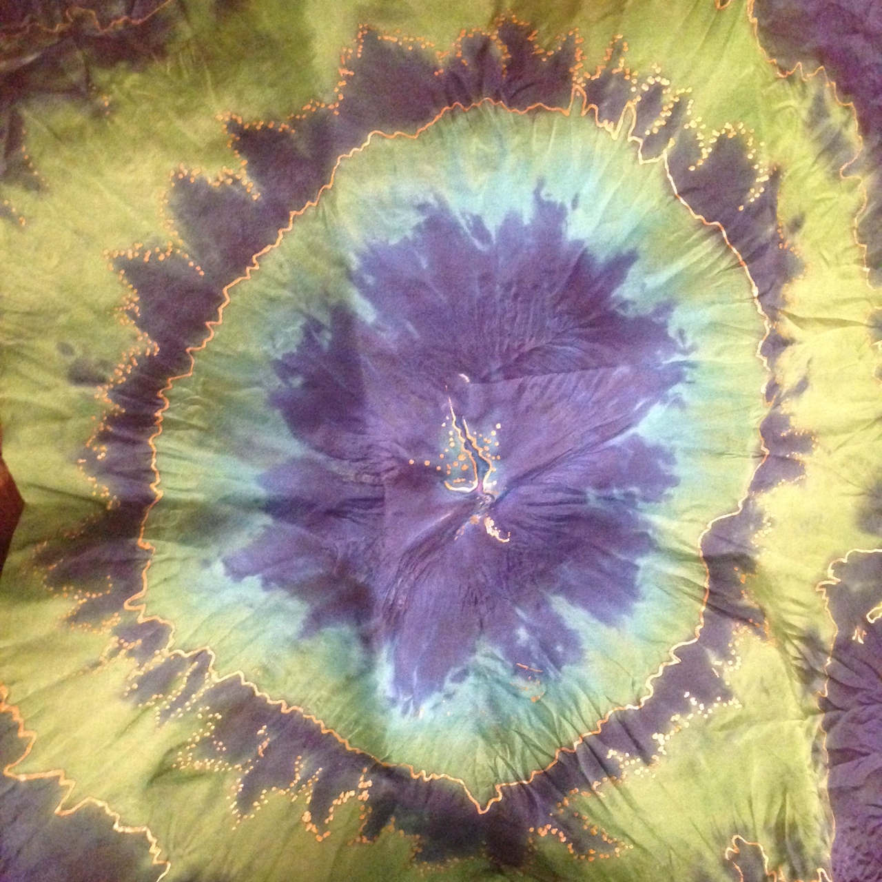
Here I must admit the photo does make it look washed out. In sunlight the chartreause is a soft lettuce color, but vibrant. These large flowers repeat 5 times on a 15″x60″ piece of habotai 8mm silk. A gentle shine of the silk is echoed by the copper resist applied to focus the eye on the design.
In the next few days, once i have processed all of this silk i will be doing my formal photos, and ofcourse I will be posting them. As you can see… i can easily get absorbed into the process of dying and accenting these wonderful pieces of silk. It is a passion that takes me to a wonderful and creative place. Some music or a book on tape, or the radio on, and its such fun!
You must be logged in to post a comment.